Years of experience in "Digital Technologies"
Proficient technical engineers
Satisfied clients across the world
Projects in web
& mobile
Fill the form, our experts would reach you soon
We assure to have your info safe with us
Many of us care about our impression. We even try getting ourselves look better by using cosmetics. And involved in practices that help us look better. There is no difference when it comes to your website. Your website is the face of your brand. Many happen to judge your business through your website.
Is your website glossy and professional? Or it looks untidy and jumbled?
Unlike clothing trends, we have website trends that are progressing. Ones that were fantastic during 2010 might look outdated in 2017. Just as your physique, your website requires some modulations every now and then to look good.
This is where the need for today’s blog post arose. I had a discussion with my web design team and have gathered a couple of points that dominate the web in 2018.
Let’s see what they have for the upcoming year.
As days roll down, people come up with great new ideas to present their business in a better way. While some are always hitting the same old fashion. The others have moved to make new resolutions to their business.
2018 would expect a greater importance of sensational typography. To make it simple for a better understanding, it is fonts with some special individuality. This is something that brands adapt to serve their customers.
For example: Consider the following design of a web development company
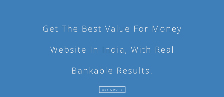
It is professional, spaced-out along with the blue background that greets the visitors. Thus, you could recognize the font as the centerpiece of attraction.
In the beginning, it was professional colors that took away people’s attention. Later, people became familiar with the same old uniform colors.
Then designers planned to use contrast colors which indulged the attention of visitors. This came into existence and even became familiar with top brands.
This strategy also includes colored fonts over contrast backgrounds. I have added an example of a website that has used this strategy.
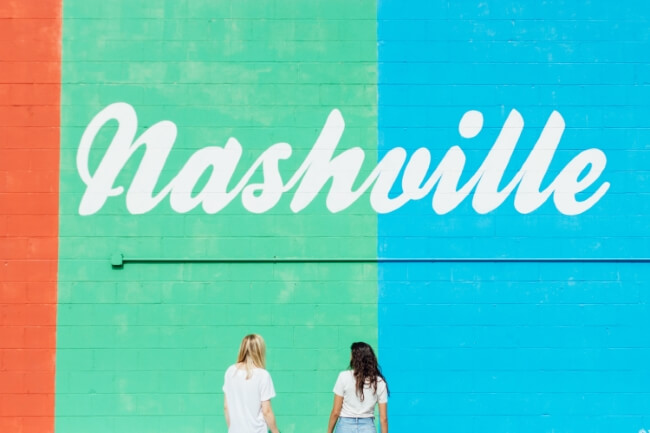
You would find them interesting don’t you? Yes?? Definitely, that should be a big YES. Because most companies have accepted this strategy into their web designs. Why not try them either?
Web designs had content that varies often on a single web page. At recent times, web designers ended up using the same font throughout the entire website.
For example, consider UBER’s web page.
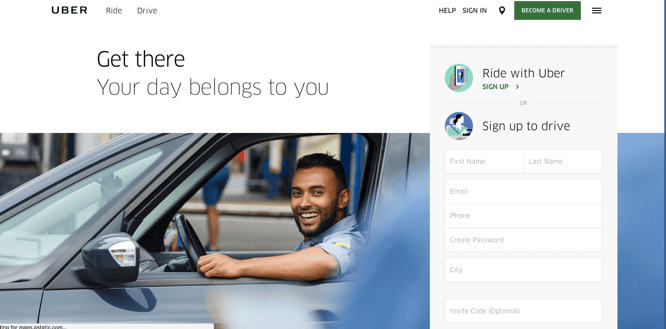
You could find the same font used up on the entire website. This helps to keep up uniformity. At the same time, they have also used bold and spacing techniques to avoid the dull look.
Features of a Perfect Website Design
Now dare to say a big goodbye to the same old cheesy Shutterstock images. Nowadays, websites are more into custom designs. Brands are developing their own illustrations to communicate to their visitors.
We are familiar with the saying “Less is more” The same applies to graphic illustrations.
Our team has noticed that simple designs work better. The highest motto of a graphic illustration is to convey the brand’s message. Of course, graphics need to be tidy enough. But not too beautiful that they become the center of attraction.
Your graphic illustration should flow along with the content. Yet that’s the toughest point. That is why simpler designs are just told than implemented. It isn’t that easy to create a simpler design that also pleases and still does not distract users.
Have a look at Symbolset’s website.
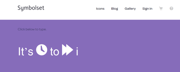
They have achieved in doing this on their website. The design is simple and effective with the graphical illustrations.
Storytelling has now become the most important part of the brand promotion. How better could a brand publicize its story through animation? This is where the need for static images are out and the animations have stepped in.
Most of the brands are trying to use some form of animation on their homepage. Service-based brands make use of simple videos that explain their business process. Product based companies display their products with the help of animations. An experience-based company uses videos that narrate stories and captures attention.
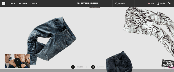
For example, the clothing brand G-star raw, a-yo’s its visitors with a video. Once the video gets over the visitors are free to browse around the web page. The interesting factor is that when a user hovers the mouse pointer, the clothes visible on the page moves a bit. And a user could click on it to know the details of the cloth. From there they could buy.
For brands that are experience-based, animations work better for them to narrate a story. They even engage the audience. At recent times, 360 videos are playing a drastic role in interacting with customers. Especially for an e-commerce website, a 360-degree video has a lot more than we expect. As people wish to know how a product looks before they buy. This would help better and have an impact on the conversions part.
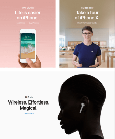
My design team added another note which was the increasing use of box designs on websites. It is where the sections of a website split with the help of these box designs.
Even Apple makes use of these design strategies throughout their site. Added they include some forceful visuals as shown below.
What are you planning for this new year? Do you find any of these trends interesting and wish to make use of them on your website? But not sure of implementing them in a better way? Then reach our web designers to get the work done on your behalf. We have experts to help you out in the exact way you wish to have your website.