Years of experience in "Digital Technologies"
Proficient technical engineers
Satisfied clients across the world
Projects in web
& mobile
Fill the form, our experts would reach you soon
We assure to have your info safe with us
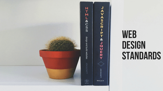
It is a big deal for web designers and creative web design companies to maintain web design standards. They need to convince both design and visitor’s need at the same time. “Standard web conventions” Are website composition models and best practices. Let me walk you through some of the best practices on web design standards.
An earlier NN group article refers to the STANDARD. From the analysis, it conveys that, how good these STANDARDS work. The following gateway helps you with better understanding,
Let us dive in deep!!
On analysis, 100% websites have a clickable logo at the top left corner.
Having a contact button or a link at the top right corner of a website seems to be best practices. As this does not come under common practice it is not considered a standard. Only 44% of the websites use this format.
88% websites seem to have main navigations at the top of every web page. Having a horizontal main navigation at the top is a web design standard.
Rotating images and slides on the home page are a common practice for 32% of websites. This is highly concentrated by orbit designers as most of the sites have a static featured image rather than rotating series of image.
The results are neutral and they might vary at times. Hence you could opt for the one that best fits your website and your visitors.
80% of marketing websites have value proposition located high on their page. So this could help their visitors to understand their value “Above the fold”. It is expected that around 85% of websites have such value plans high on their home page and the rest are not clear of their value propositions.
A common note of web designers is “There is no standard pixel height for browsers”. Hence, there is an absence of fold. And some design elements appear high on pages and are visible to most visitors without scrolling.
A very common thing that every visitor looks out for and that half the percentage of websites have failed to display it for their visitors is the SEARCH tab. Around 54% of websites have search features in the header and the rest have failed to display the search tab globally on pages either as links or buttons.
But, SEARCH tab is something that needs to be placed when there is a huge amount of content. When there is not enough content or if the website is poorly organized, a SEARCH tab is just a “Brace”.
24% of websites allow visitors to sign up and subscribe to email updates in the footer. It is a common way of collecting e-mail address. But this cannot be considered a web design standard.
The very common content that most websites use are,
Moreover, visitors look out for information at the bottom right or at the bottom center of the web page.
As social media platforms are a common promoting center for all businesses, websites have them in the footer. And this has become a very common practice. 72% of the websites seem to have social icons in the footer and the rest 28% in the header section.
The main cause for having social media icons in the footer is to reduce visual eminence. The full-color version appears when the visitor moves the mouse cursor across the icon. So, this reduces the bounce rate as visitors crawl down the page to hit the social media button. This directs them straightaway to the social media page.
Around 68% of websites are mobile responsive web designs. This builds a great experience for users on smartphones, tablets, and desktop. This includes a combination of design and programming as well. It is a part of the redesign and cannot be considered to be a web design standard.
Responsive web designs are practiced for years together and it has become very common and needs to be standard eventually.
Not all web designs are standards. Other than the logo placement, main navigation and value proposition there are no big standards for web design. Web design conventions have a prominent call to action, search tool in the header, social media icons in the footer and web responsiveness.
There are other common design features that can be considered as best practices, but they cannot be used as the major part of designing a website. Custom web design, specific to business and audience ruins the major part.
Consistency in standards is the easiest way to meet expectations of your audience. There are millions of websites that your visitor might have come across and they reach you with a lot of ideas on where and how to get things. So your website is a key spot in digital marketing strategy.
If a design is expected at a certain place then it has to be where it should be. In spite of design elements, there are some design standards that all trained designers get to know easily.
Stick with a style guide for your website and try to maintain the same color, type, and tone of your business.
Programming should be built on programming standards that are agreed on W3C. This makes websites to behave properly on browsers.
Follow the standards that remain access-friendly to visitors.
Final word:
Standards are very important on designing a website, if you are going to break them, then you should be doing it with a good intention. Make sure that you plan out for the unexpected impacts that occur on breaking the rules.
Are you following the rules? Or are you breaking them?