Years of experience in "Digital Technologies"
Proficient technical engineers
Satisfied clients across the world
Projects in web
& mobile
 +91 9600007006 / +1 860 730 3280
 info@k2bsolutions.in
 k2b.sales
Fill the form, our experts would reach you soon
We assure to have your info safe with us
Mobile is everything, and it is constantly evolving to make the future more focused on improving the overall performance. Nearly 17% of the smartphone users in the United States use their mobile phones to surf the internet. When it comes to the user interface, it is mandatory that the websites have to adapt to the varying screen size of the mobile devices. There are options like mobile websites or mobile applications, but they are little tricky or harder to maintain. This is the main reason why responsive website design (RWD) became the only option and is cost efficient and consistent.
Responsive web design is a design approach used for creating a website that automatically adjusts or adapts to the devices of various screen sizes. This method is already at its peak and in the current design strategy, it is said to be mandatory as more and more people are searching for information on the internet using their mobile devices. Following are the best practices of responsive web design:
Responsive website design process is mostly carried out with the help of frameworks like Bootstrap, Foundation, Skeleton, and many other. Even though there are many advanced and efficient frameworks available for front-end development, Bootstrap remains the favorite choice of best responsive web design companies and top freelancers as it has been promising since the release. Frameworks are not so mandatory to design a responsive website but they have many benefits and here are some ways that frameworks can help:
Read more – Advantages of responsive websites over the mobile websites
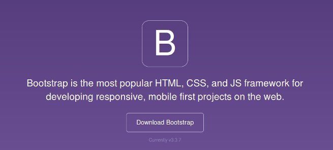
Bootstrap is one of the most modern front-end development framework used by most of the top web developers in the world. Designed by a designer and developer from Twitter, it was initially identified as the Twitter Blueprint and later made into an open source framework. Bootstrap is mobile first front-end framework developed along with technologies like HTML, CSS, and JavaScript. Bootstrap is stripped down into three major files
Bootstrap needs jQuery which is the popularly and widely used JavaScript library used for simplifying and adding cross-browser compatibility to the JavaScript.
The bootstrap framework has the primary advantage of having a large number of accessible resources. Here are the most popular reasons why to choose Bootstrap over other frameworks.
Bootstrap is a sleek, powerful and intuitive framework used for designing responsive websites in fast and easy manner. Unleash the features of Bootstrap to build a creative and full-functional responsive websites.